
Our eyes naturally prefer things that are neat and well-arranged, which is why strong visual design matters. Good design is more than just making things look pretty. It plays a key role in helping people understand information quickly and clearly. The way things look on a screen or page can shape how we understand and enjoy them, whether it's a website, mobile app, poster, or textbook. Visual design aims to make information clear, simple, organized, and user-friendly. Designers use the principles of visual design to create layouts, graphics, and visual content that are balanced, meaningful, and easy to follow.
What are Visual Principles?
Visual principles are fundamental guidelines that shape the placement and arrangement of elements on pages or screens. These rules help organize shapes, text, colors, and images to create order, balance, and clarity making content easy to understand and view. Designers apply these principles to tell stories without words determining what should grab attention first and what follows. You can spot these principles every day like on traffic signs, textbooks, apps, websites, billboards, and even game interfaces.
Principles of Visual Design:
1. Balance
Balance is about arranging elements like shapes, colors, text, and space to create a sense of stability and visually pleasing design. It helps prevent a lopsided or heavy appearance giving the layout a steady and enjoyable look. Two main types of balance exist: symmetrical and asymmetrical. Symmetrical balance makes both sides of the design look equal or identical, while asymmetrical balance uses different elements that still feel weighted. A design with good balance keeps viewers' eyes at ease and improves the overall tidiahreness of the layout.
2. Contrast
Contrast means showing the difference between design elements to make important parts stand out. It can be created using color, size, shape, or font. For example, black text on a white background or a dark heading on a light background provides strong contrast and improves readability. Contrast improves visibility, brings focus and clarity, and makes designs more engaging. It also helps users with low vision or color blindness distinguish elements clearly.
3. Alignment
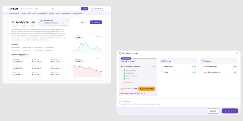
Alignment refers to how elements are lined up in a design, such as text, images, and shapes. It gives the layout a clean, organized, and professional look. Proper alignment helps users follow the flow of information easily and creates a sense of order and connection between different elements. Whether aligned to the left, center, right, or along a common edge, aligned items feel like part of a unified system—even if they differ in size.
4. Hierarchy
Hierarchy is about organizing things based on how important they are. It helps people look at stuff in the right order—what to check out first next, and last. Designers make this visual structure using size, color, boldness, and where they put things. Big or bold things catch your eye more, while bright colors and putting something at the top also make key items stand out. If there's no hierarchy, everything looks the same, which makes it tough for folks to get the message or find their way around the content effectively.
5. Proximity
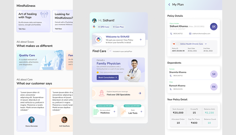
Proximity is about putting related stuff close together to show they're part of the same group. When things are near each other, people see them as connected, which makes information more organized, easier to look through, and quicker to get. Good proximity cuts down on visual mess, steers clear of confusion, and creates clear sections that make the overall user experience better. Designers often use white space and grid systems to keep proximity effective and make sure the layout is clean and meaningful.
6. Repetition
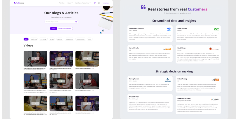
Repetition means using the same elements or style again and again in a design to build consistency, unity, and rhythm. Designers often repeat colors, shapes, fonts, lines, or patterns to create harmony and strengthen the overall layout. This repetition helps users recognize patterns and understand how to interact with a design. It also improves recognition and creates a smooth flow across different sections, making the entire layout feel cohesive rather than a collection of separate parts.
7. White Space

White space, also known as negative space, is the empty area around and between design elements. It doesn't always have to be white—it can be any background color. White space gives breathing room to content, improves readability, and prevents designs from feeling crowded. While some may see empty space as wasted space, it is actually a powerful tool that adds clarity, focus, and balance. It emphasizes key parts directs the eye across the design, and helps readers stay engaged—similar to the gaps between paragraphs in a blog post.
8. Unity
Unity means every part of a design works together as one system. It makes sure everything looks like it fits creating a layout that feels complete, connected, and nice to look at. Designers create unity by using the same color schemes, fonts, spacing, and visual styles throughout. Unity builds a strong visual language, which makes the message clear and powerful. It improves the user experience, strengthens brand identity, and helps to build trust.
9. Emphasis
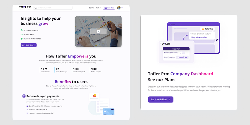
Emphasis involves making certain design elements stand out to guide viewers' attention and spotlight what matters most. Designers create emphasis through size, color, shape, placement, or boldness—for example, a big colorful button or a bright red "Buy Now" button that catches the eye more than a plain gray one. This helps people zero in on key messages, actions, or features and pushes them to take the desired step. When the emphasis is done right, viewers move in the intended direction and connect better with the design.
10. Movement
The way a viewer's eye travels across a design is known as movement. It guides people from one section to another. This creates a visual flow and tells a story, either from top to bottom or left to right. Designers have an influence on the eye's direction through the use of lines, arrows, shapes, contrast, and how they arrange items. When movement is done well, it keeps people interested, makes navigation easier, and stops distractions by making sure each part flows into the next.
Conclusion
The core of every clever design lies in the basic principles of visual design. These include balance, contrast, alignment, proximity, hierarchy, repetition, white space, unity, emphasis, and movement. When combined, these elements help users feel at ease and self-assured as they interact with a product or take in information. This has to do with the route the eye takes using lines, shapes, contrast, and direction to create a visual flow and tell a story—whether from top to bottom or left to right.
Aakriti Jain is a UI/UX Designer with 6+ years of experience creating intuitive web and mobile interfaces. At Squareboat, she focuses on user research, wireframes, visual design, and scalable design systems to deliver clean, user-centric experiences
