
Have you ever seen a blueprint for a building before its construction? A wireframe is just like a blueprint used for planning websites or applications. Designers and developers create wireframes before they start building any website or application. It helps them to carefully plan the layout and decide what features will be included. It shows the placement of elements and how users will navigate through the pages or screens. Wireframes don't focus on colors or images; instead, they concentrate on the structure application. In this article, you'll discover what wireframes are, understand why they're important, and view some common wireframe examples that give a clearer understanding.
What is a Wireframe?
A wireframe is a simple sketch that shows a website or application’s appearance and functionality. It displays the placement of elements like buttons, menus, and images. Designers usually create wireframes in a black-and-white color system using lines, boxes, and simple text. They don't use any decorative elements like colors or graphics. These sketches help designers plan the overall user interface and the navigation flow. Wireframing serves as the initial step before building anything concrete starts and helps everyone grasp the layout and understand how users will navigate from one screen to another.
Why is Wireframing Important?
- Clear Planning Before Coding: Wireframes allow designers and developers to plan everything before they start coding. They provide a basic but solid foundation to follow which saves time and effort down the road. Without wireframes, teams might forget key elements or end up designing something that doesn't function well. A wireframe serves as a guide map for the entire project.
- Easy Communication Between Teams: Wireframes allow designers, developers, and clients to share ideas more effectively. Everyone can see the project's visual layout and give their thoughts or ideas. This ensures all stakeholders are on the same page and avoids mix-ups during the process.
- Better User Experience (UX): Wireframes show how people will use the app or website. They help map out the steps users will take to interact with a website or app. Designers can check these steps early on and spot issues before building the actual product. This makes the user experience better and everything easy to use.
- Cuts Costs and Time: Tweaking a wireframe is quick and takes only a few minutes. However, making changes after coding the entire website or app can cost a lot and will take a lot of time. Wireframes let you test and fix things early which saves time and reduces development costs in the long run.
Spots Missing Features: Sometimes development teams may overlook certain key features. A wireframe makes it easier to identify any missing components or functionalities. This results in a more comprehensive and practical end product.
Top 10 Wireframe Examples
Wireframes are generally categorized into three levels—Low-fidelity, Medium-fidelity, and High-fidelity wireframes. Each level provides a different level of detail and clarity. Let's check out some wireframes examples to understand each of these levels.
Low-Fidelity Wireframe Examples:
1. Basic Website Homepage Layout
This wireframe gives you a basic idea of how a homepage is set up. It consists of a header with a logo and menu, a big hero section with a title and a button, content blocks for services, about us, and a footer at the bottom. You won't find any fancy fonts or pictures here - it's all simple rectangles and lines that help you figure out where to put stuff on your page.
2. Mobile App Login Page
This design includes simple boxes for email and password input fields, a small "Forgot Password" option, and a login button. At times, icons are marked using circles or squares. This outline just shows how things are arranged and doesn't get into exact design specifics. People often draw it on paper or use basic digital tools to create it.
3. Simple Contact Page Sketch
This wireframe has boxes to fill in your name, email, subject, and message. You'll see a big submit button to send your form at the bottom and also a small area showing how to reach out, like phone numbers and where to find us. It helps to arrange parts of a support or contact page.
Medium-Fidelity Wireframe Examples:
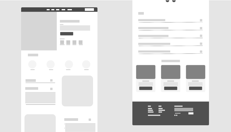
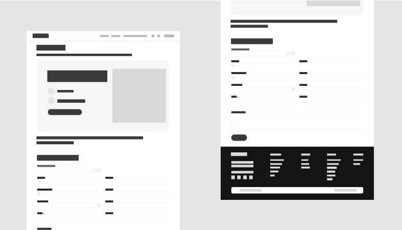
4. Product Detail Page for E-commerce
This wireframe displays the product image block on the left side and product information on the right. It includes sections to show the title, price, size options, quantity selector, and an "Add to Cart" button. Below these elements, you'll find blocks for reviews and product descriptions. Each section has labels and a design that shows spacing and alignment. It aims to improve the shopping experience.
5. Admin Dashboard Page
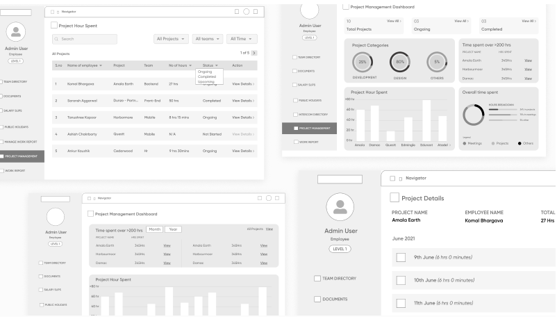
This layout puts the sidebar menu on the left side and the main content section on the right, which shows graphs, tables, and cards. Each card stands for a metric such as users, sales, or orders. Icons have placeholders in their place, and filters or search bars are clearly marked. This allows developers to plan data structure and controls. Designers often create it using wireframing tools like Balsamiq or Figma.
6. Blog Post Page Design
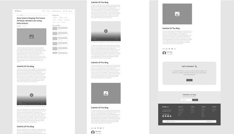
This wireframe showcases a space for the blog title, the author's name, and the date of publication. The main content area takes up most of the page. To the right, you'll find a sidebar displaying recent posts and tags. At the bottom, there's room for comments and a box to sign up for a newsletter. Each section has its own label designed using columns and rows to organize everything. It gives you a good sense of how the page will look and how easy it will be to read.
High-Fidelity Wireframe Examples:
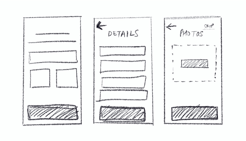
7. Signup Flow with Multi-step Forms
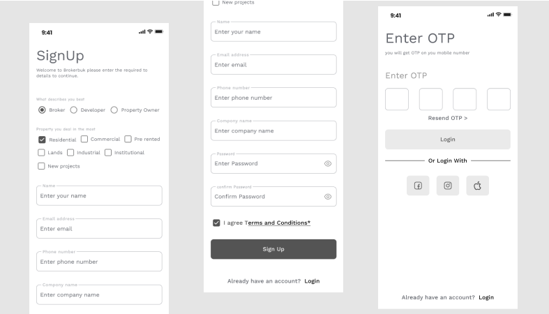
This wireframe displays a signup form with multiple steps. It shows progress indicators, fields for input, messages for validation, and different button states. Each screen in the form links to the next one also including states for errors and messages for success. This wireframe looks similar to the final screen but still uses basic styling.
8. Food Ordering App Interface
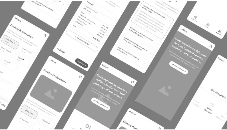
This layout depicts a user picking a restaurant, selecting a meal, adding it to their cart, and checking out. The icons and spacing between elements are precise. It has placeholders for food pictures, cuisine filters, and screens to track orders. App designers use this blueprint to check screen changes and user paths on mobile devices. These in-depth wireframe examples help test how users move through the app before adding visual elements.
9. Portfolio Website Layout
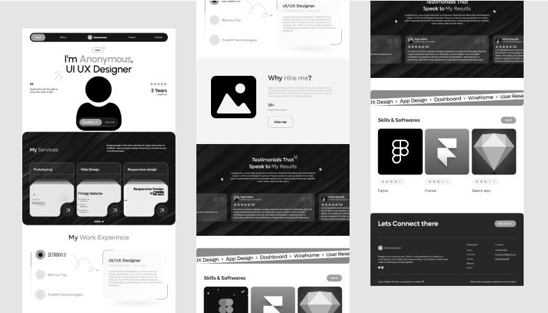
This wireframe has a main image area, a spot for a personal story, a grid to show off projects, bars to display skills, and a form to get in touch. Each part lines up with the right space between them and is sized properly. Buttons and menus are shown in detail. This blueprint helps show personal branding in a clear way.
10. Landing Page for Lead Generation
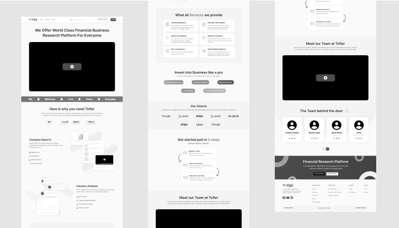
This wireframe displays a headline section with some explanatory text, a button to prompt action, a form to capture leads, trust indicators, customer feedback, and a footer. The layout maintains a tidy and symmetrical appearance. Page elements follow a clear order of importance. Design teams use this to evaluate page effectiveness and sign-ups before finalizing the design.
Conclusion
Wireframes stand as the first and key step to building websites or apps. They help in planning the layout, flow, and structure clearly before the coding starts. They assist teams in planning better, sidestepping errors, and building quicker. Whether it’s low-fidelity wireframe examples for simple sketches, medium-fidelity wireframe examples for layout planning, or high-fidelity wireframe examples for testing realistic designs, each type serves a specific purpose. Using good wireframe examples ensures fewer errors, better teamwork, and a smoother development process. From website wireframe examples to mobile app wireframe examples, wireframing helps build well-structured, user-friendly, and successful digital products from the start.
Aakriti Jain is a UI/UX Designer with 6+ years of experience creating intuitive web and mobile interfaces. At Squareboat, she focuses on user research, wireframes, visual design, and scalable design systems to deliver clean, user-centric experiences
